
BiteBack
- UX Case Study
Turning Excess into Impact—Redesigning Food Rescue for Engagement and Accessibility

At-A-Glance
BiteBack is a mobile platform designed to reduce food waste by connecting restaurants with surplus food to individuals and organizations in need. Developed as part of a UX-focused class project, Version 1, which I led, introduced a community-driven experience with features like surplus food listings, social engagement, and a rewards system. Usability testing revealed areas for improved navigation, engagement, and personalization, leading to Version 2 (developed collectively as a team), which refined key workflows. This case study explores the design evolution, user research insights, and the impact of UX decisions in making food rescue more accessible, intuitive, and rewarding.
Role
Product Designer
UX Researcher
Team
Niharika Pundlik
Mayuri Uttarwar
Ranga Sai Kumar Bobbadi
Timeline
Ames, IA
October 2024 - December 2024
Tools
Figma, Otter, Taguette
📱 HIGHLIGHTS
Seamless Food Donation Flow
A streamlined, intuitive process for restaurants to list surplus food effortlessly.
Real-Time Food Availability
A live feed displaying nearby surplus food donations with filtering options for accessibility.
Community Engagement
A social feature allowing users to share experiences and encourage participation.
Trust & Freshness Features
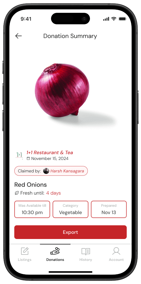
Donation listings include timestamps, prepared date and fresh until information to ensure food quality.
🍽️ INTRODUCTION
Project Overview
BiteBack is a mobile platform designed to reduce food waste and promote food security by connecting restaurants with surplus food to individuals and organizations in need. The app enables businesses to list excess food, while users can locate and claim it in real-time.
My Role
I led the design of Version 1, focusing on:
✓ Wireframing and prototyping
✓ Designing core user flows (food donation, claiming food, and community engagement)
✓ Conducting usability testing and analyzing user behavior
✓ Iterating based on insights to improve navigation and engagement
Version 2 was designed collectively by the whole team, building on the findings from my work in Version 1.
🔍 PROBLEM STATEMENT
The Food Waste & Food Insecurity Paradox
40% of Food is wasted annually in the U.S.

Despite it, millions struggle with food insecurity. Restaurants and food businesses often discard surplus food due to logistical challenges and liability concerns.
Key Challenges
Lack of a seamless food donation process
Existing methods are inefficient and manual.
Limited awareness among users in need
People facing food insecurity often struggle to find donation sources in real-time.
Concerns about food safety and logistics
Restaurants hesitate to donate due to regulatory uncertainties.
🗣️ RESEARCH & USER INSIGHTS
User Interviews & Key Findings
To understand the needs of two key user groups –
,we conducted seven user interviews in total (graduate students, restaurant owners, and community members facing food insecurity).
Interview Protocols
We created two separate protocols for interviewing Users (Individuals claiming food) and Restaurant Owners (Restaurants donating food) while asking additional follow-up questions as and when needed.


After conducting the interviews, we extracted some key findings from both the user groups.
Findings
Claimers
Users lacked awareness and resources to find surplus food. Their primary concerns included freshness, quality, and food safety. They expressed a need for better filtering options to locate food quickly.
"I didn’t even know restaurants were willing to give away leftover food. If I had an app to show me where to go, I’d definitely use it." – Interviewee, Graduate Student
Restaurant Owners
Many restaurant owners generated surplus food but struggled with logistics, liability concerns, and scheduling pickups efficiently. They sought a frictionless donation process with tracking and visibility.
"If I could donate food without worrying about people getting sick and blaming us, I’d be happy to do it." – Interviewee, Restaurant Manager
Both Groups Required Trust Indicators
Both claimers and restaurant owners expressed the need for trust indicators, such as freshness indicators, timestamps, and donation ratings, to ensure food quality and availability.
Additionally,
We used Taguette to understand and highlight the key points from the transcripts. This also helped us later to make our themes for the Affinity Mapping.


👁️ PERSONAS & MAPPING
The Spark of Discovery
Seven interviews gave us a window into real struggles—students like "User 1" (from the above Taguette screenshot) craving fresh food fast, and restaurant managers dreaming of hassle-free donations.
We didn’t just stop at notes; we sifted through transcripts with Taguette, pulling out golden nuggets like;
“Freshness is the topmost priority”
and
"I’d donate if it were safe.”
These voices begged for solutions, so we gave them faces.
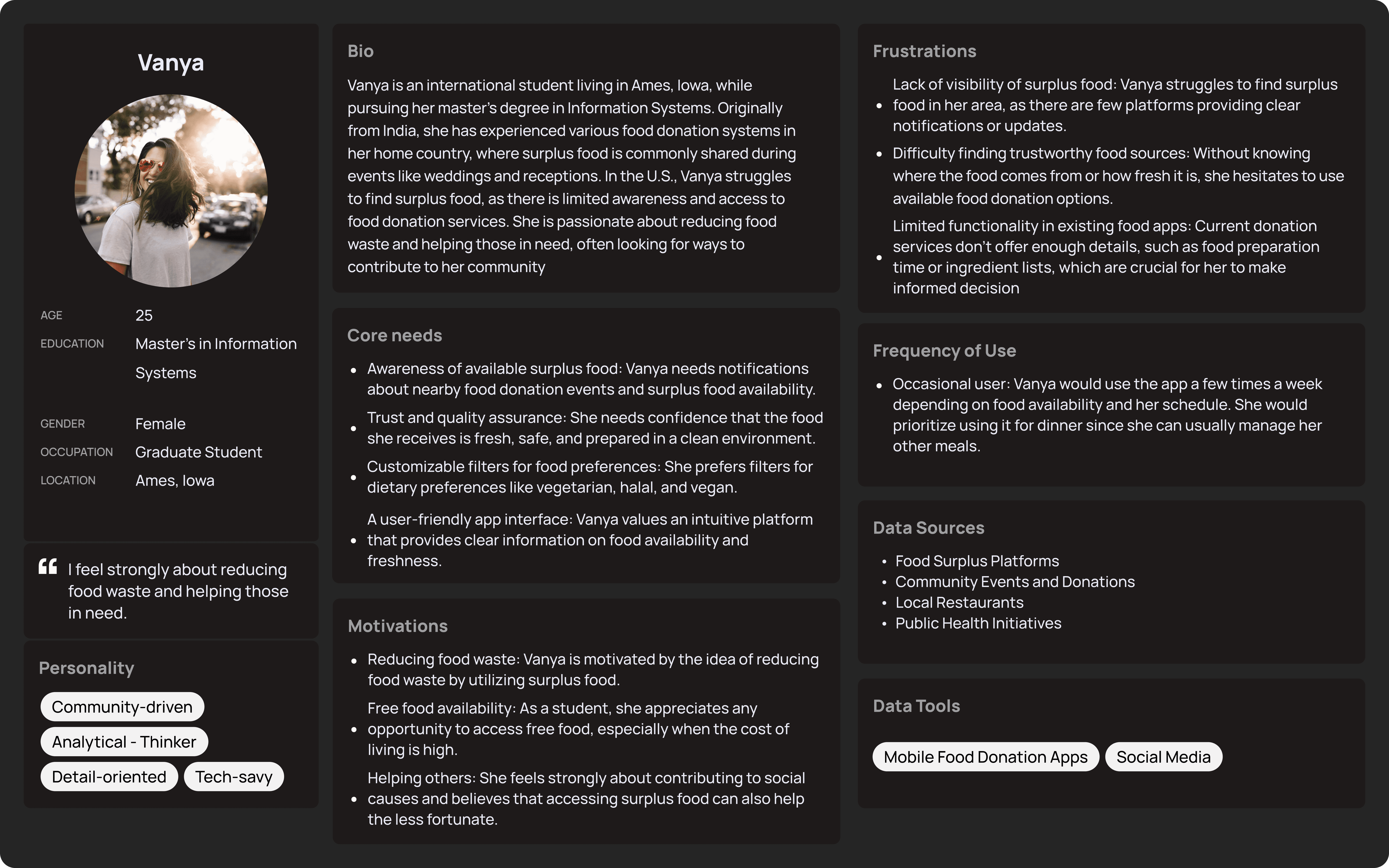
Meet Vanya and Stella
Out of the chaos of quotes and concerns emerged two stars:
Vanya, a 24-year-old grad student in Ames, Iowa. She’s juggling classes and a tight budget, saying, “I didn’t even know restaurants had leftovers to give!” She needs speed, safety, and a way to feel connected.
Stella, a 45-year-old restaurant owner with a heart for her community. “If I could donate without the worry,” she mused, “I’d be all in.” She’s after simplicity and trust.
These two became our guides, born from the interviews, their stories echoing every pain point we heard.
Mapping their worlds
We tossed all those insights—filters, trust, logistics—onto a giant affinity map. Sticky notes flew: “Quick access” for Vanya, “Flexible pickups” for Stella. Patterns emerged—both craved transparency, like timestamps. Some ideas (overly tricky filters) got the boot, keeping it lean.
FigJam Board for BiteBack: Link
Red = Discarded Pile
Blue = We will consider these features
Green = Final features
Their Journeys Come to Life
Vanya's Journey
Picture her opening BiteBack, spotting a fresh sandwich nearby, claiming it in a tap, and earning points for a “rescue mission.” She’s not just fed—she’s part of something bigger.

Vanya's User Journey Map
Stella's Journey
She logs in, lists surplus soup with a pickup window, tracks it’s claimed, and sees her waste drop. It’s easy, and she’s proud.
Stella's User Journey Map
This wasn’t just guesswork—it was our interviews, distilled into people and plans, ready to shape BiteBack.
🧑🏻💻 DESIGN PROCESS
Sketches: Starting Point
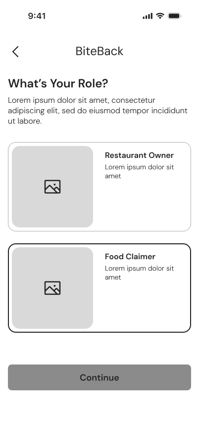
Vanya and Stella’s needs were clear—speed for her, simplicity for her. We began with sketches, rough outlines on paper: a claim button for Vanya, a donation list for Stella, and a space for them to connect. These early drafts captured the core ideas, setting the direction for what BiteBack could become.


Sketches
We drafted four sketches for each of BiteBack’s top four screens, exploring different approaches. After review, we refined them down to a single, focused design for each.
Lo-Fi Wireframes: Building Structure
Next, We turned those sketches into lo-fi wireframes. Simple grids mapped Vanya’s path to finding food, Stella’s process for listing donations, and a community feature to link them. It wasn’t detailed—just the bones of the app, enough to test the flow and refine the concept.


Lo-Fi Wireframes
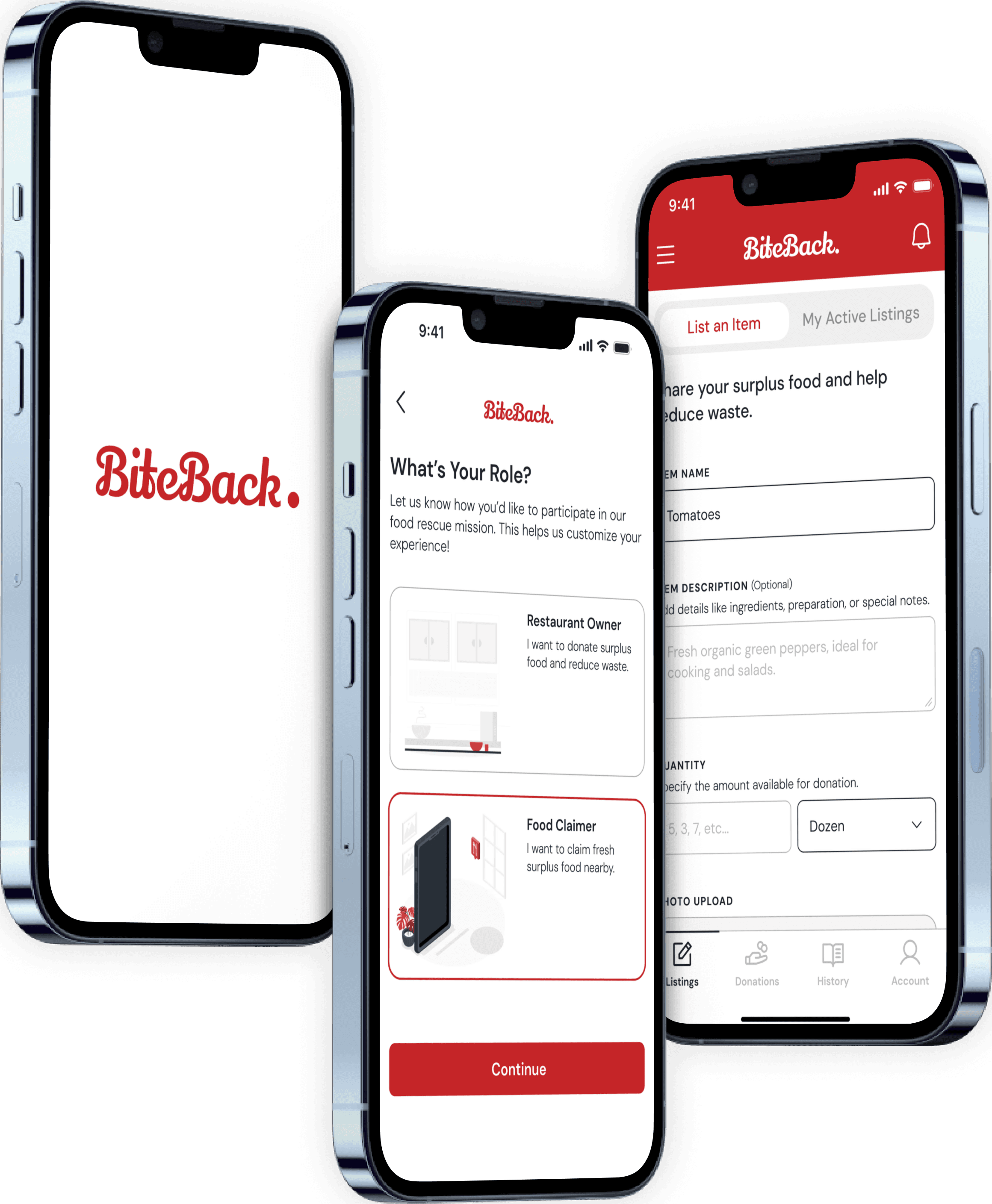
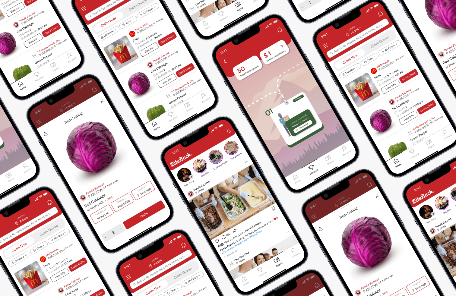
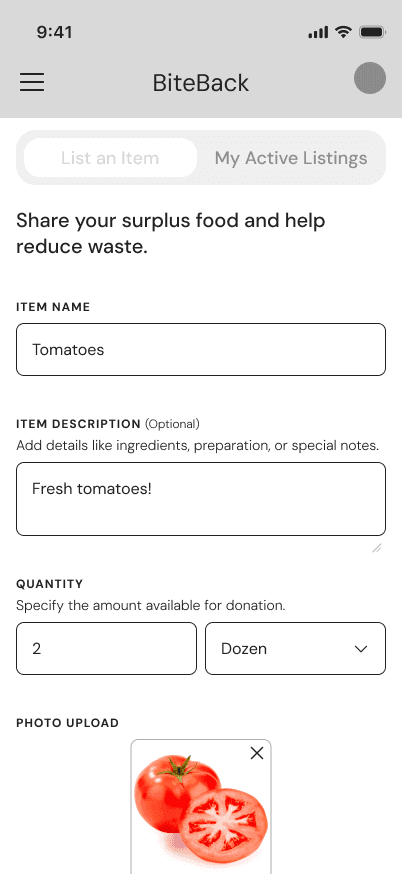
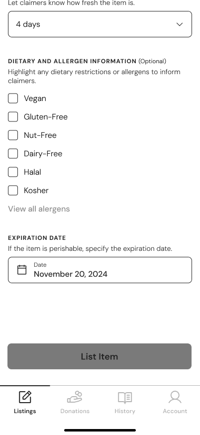
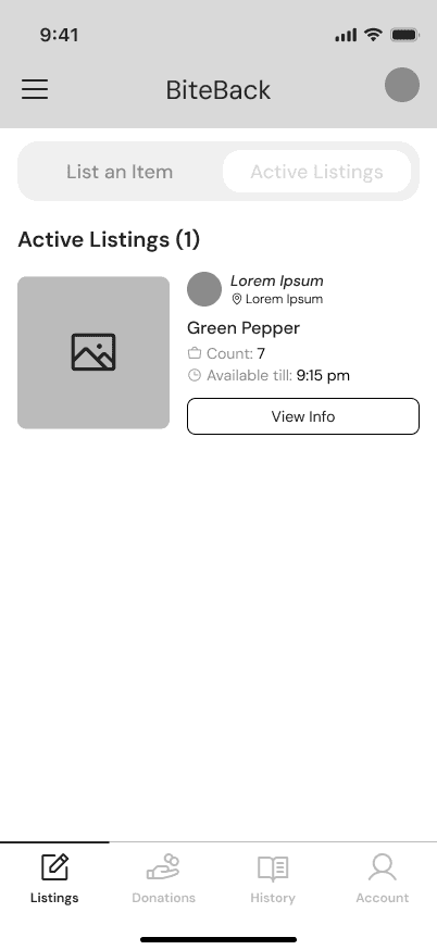
Hi-Fi Wireframes: Final Form
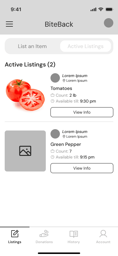
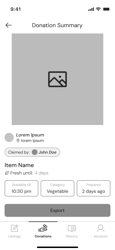
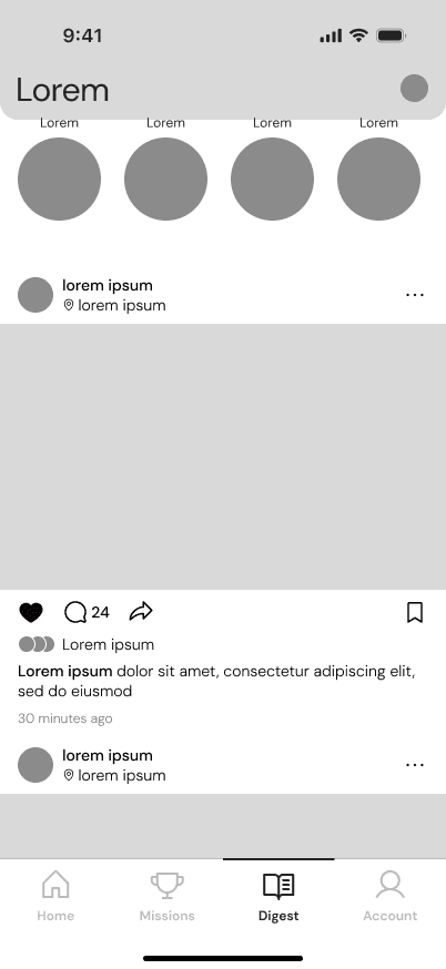
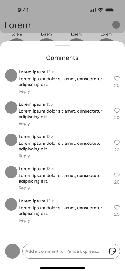
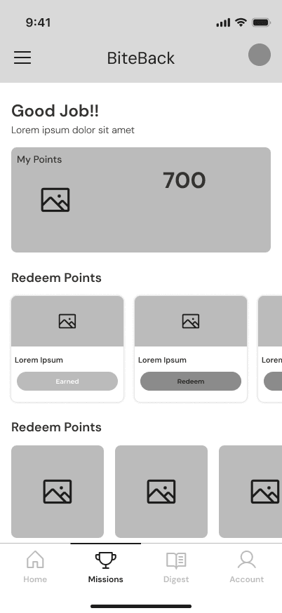
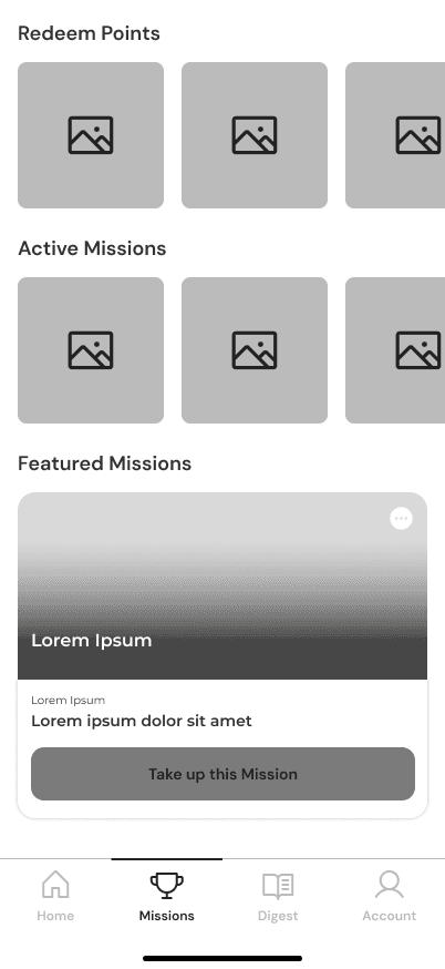
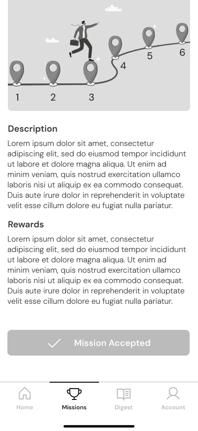
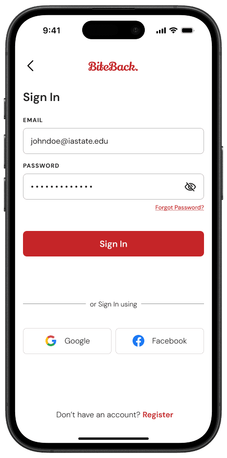
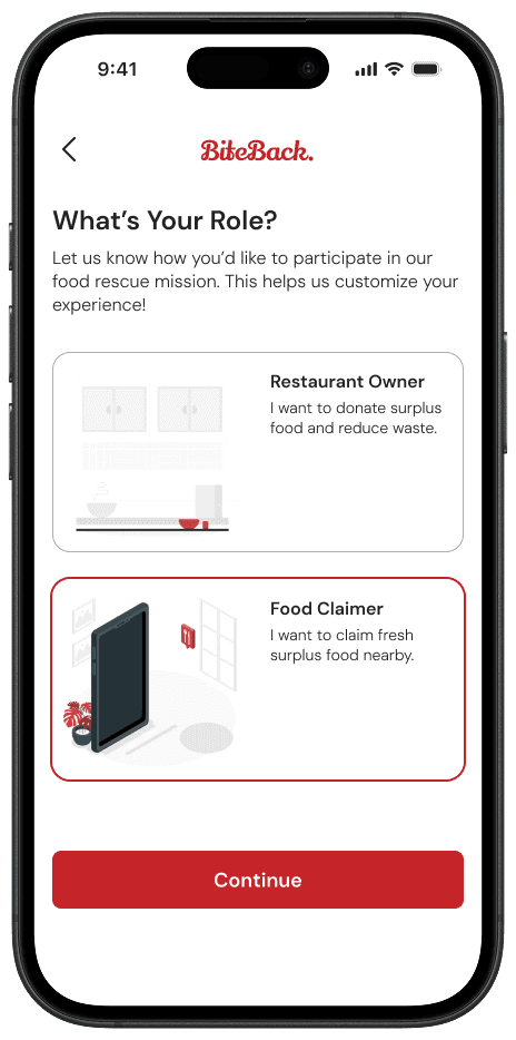
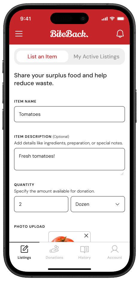
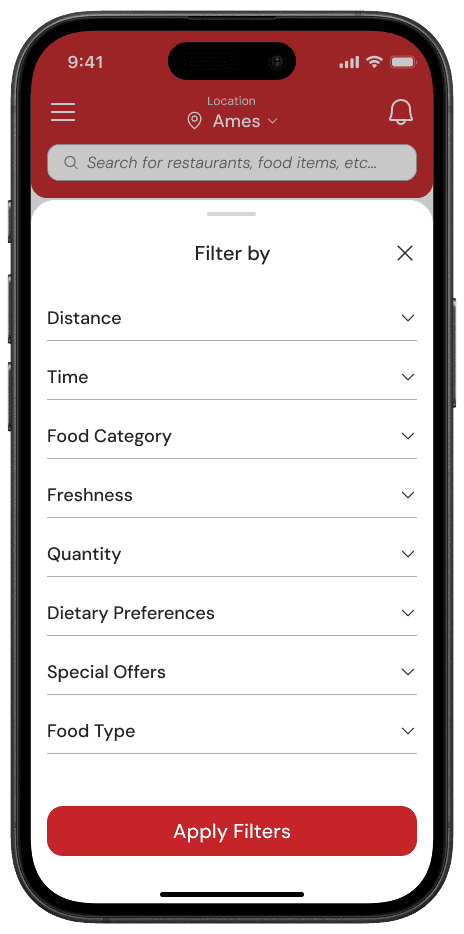
The wireframes evolved into hi-fi prototypes—functional and polished. Vanya could filter and claim food in one tap, backed by freshness indicators. Stella got a streamlined donation system with pickup scheduling and trust markers like timestamps. A community section added engagement with points and posts. This was BiteBack, ready for real users.


HI-Fi Wireframes
🛠️ USABILITY TESTING & ITERATIONS
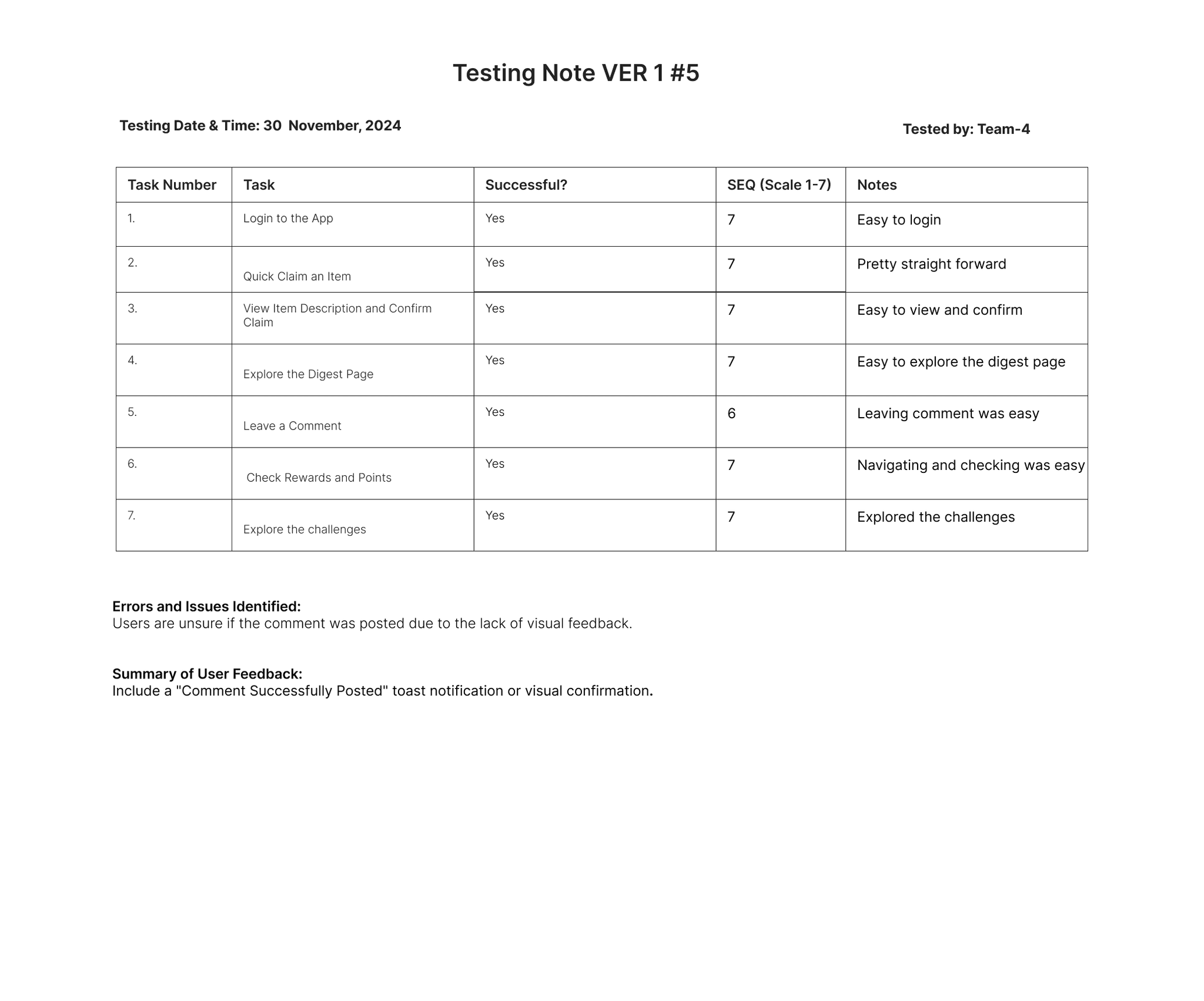
Version 1 Testing Insights
We conducted usability testing with 8 users, evaluating core user flows.
Findings
SUS Score: 72% (Moderate ease of use)
Pain Points:
Confusing navigation in community & challenge pages
Lack of feedback after key actions (e.g., login, comments)
Personalization features missing

Version 1 SUS Score Report
Version 2 – Enhancements Based on Findings
After gaining insights from Version 1 Usability Testing, Version 2 was designed with few refinements and design changes.
✅
Gamification & Rewards: Users earned points for engagement.
✅
Enhanced Navigation & Filters: Faster access to food donations.
✅
Better Visual Cues & Animations: Improved interactivity.


Three "Version 2" Hi-Fi Wireframes
Version 2 Testing Insights
To validate the improvements, usability testing was conducted for Version 2, focusing on the newly introduced features and enhancements.
SUS Score: Increased from 72% to 86%, indicating a significant improvement in usability.
Pain Points Resolved:
Navigation flow was much clearer, reducing confusion in the community & challenge pages.
The rewards system increased engagement, with users more motivated to participate.
Food claimers found the filtering system more intuitive, reducing search time.

Version 2 SUS Score Report
📈 UX EVALUATION & IMPACT
To evaluate the design further, we created design protocols for both Version 1 & Version 2.


Version 1 & Version 2 Design Protocols
With design protocols in place, we evaluated both versions to assess their effectiveness and uncover more areas for improvement.